Gusto rebrand
Senior designer — 2019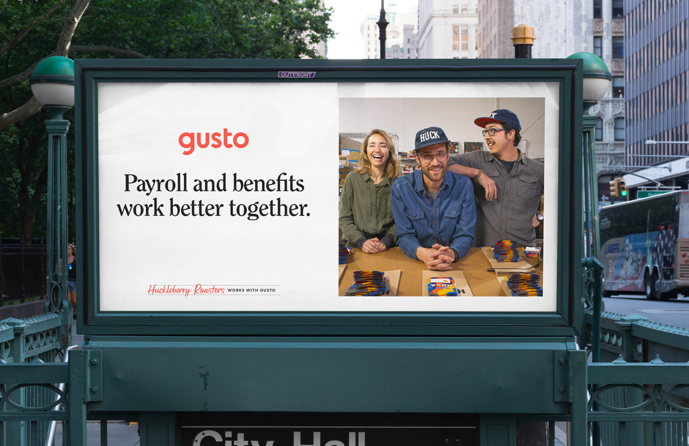
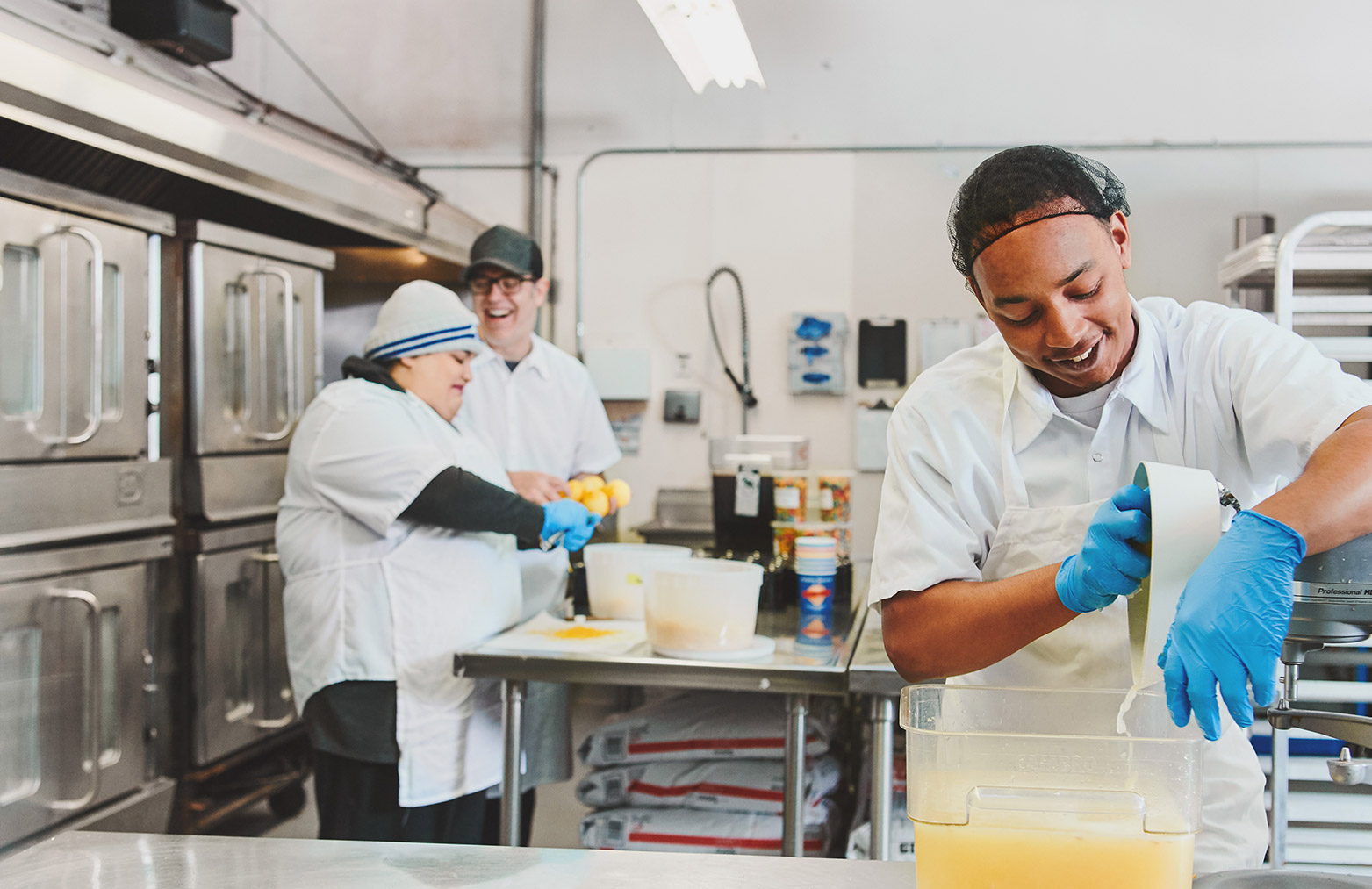
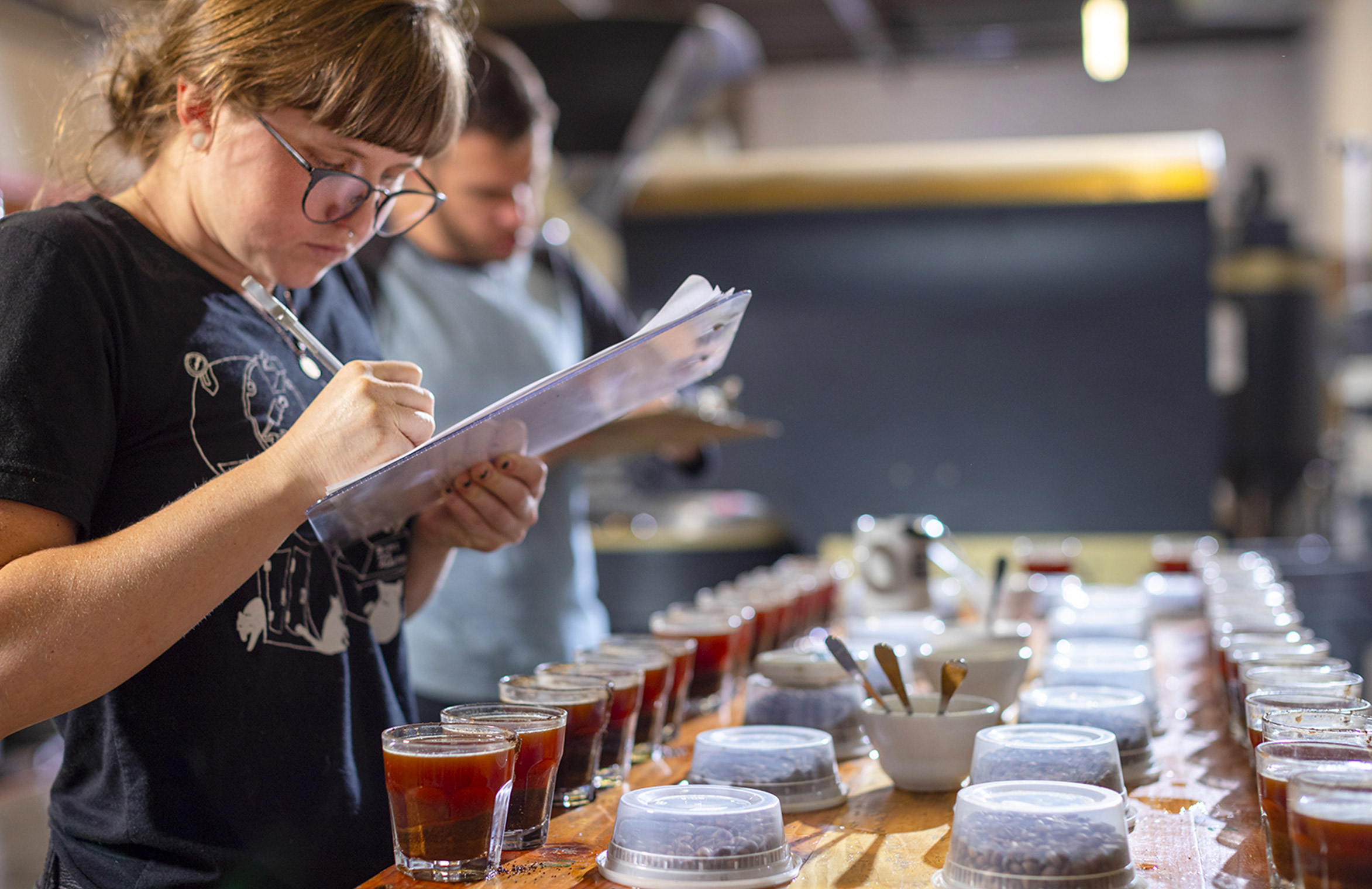
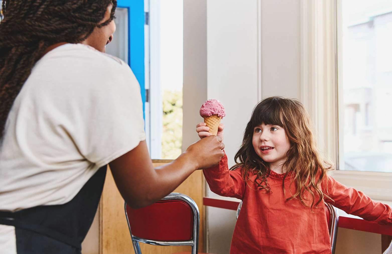
Celebrating humanity at work
Gusto is the one place modern employers can go to onboard, pay, insure, and support their hardworking teams. Gusto supports over 100,000 small businesses across the United States. Those customers are at the core of the company’s mission. Gusto rebranded in 2019 to create a people-centric brand that embraces what it means to be human at work.
I had the opportunity to work on the team that reimagined the company’s mission, strategy and visual identity. Our goal was to create a brand system that was scalable, differentiated, warm, and sophisticated.
I helped lead the visual direction of our rebrand by teaming up with a small task force of copywriters, designers and strategists.
I helped lead the visual direction of our rebrand by teaming up with a small task force of copywriters, designers and strategists.
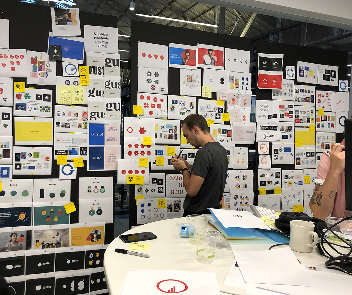
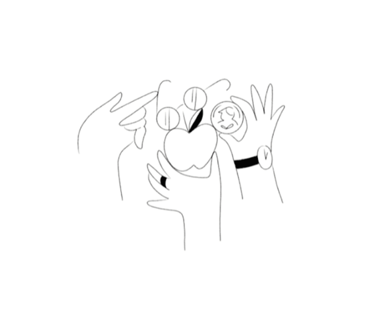
Early visual design explorations
 A shot of the “drops” from our stakeholder reviews
Just palin’ aroung
Brand positioning
We knew that establishing an insights-driven and authentic brand positioning was a crucial first step in creating a long-lasting brand.
An early insight that emerged from interviews with dozens of small businesses owners was that they care about their people. They want to celebrate their teams by providing more than just fair compensation. They want to inspire, foster growth, and create a great culture.
An early insight that emerged from interviews with dozens of small businesses owners was that they care about their people. They want to celebrate their teams by providing more than just fair compensation. They want to inspire, foster growth, and create a great culture.
Based off of that insight, we can up with our new brand positioning: We foster humanity at work. We want our brand to tell the full story of what it means to be human at work. That means celebrating heroic moments, as well as difficult ones. Our brand tells the story of real people who inspire us and the incredible things that happen when we work together.
Early explorations
Armed with a clear understanding of our users and our brand positioning, a small task force of designers and copywriters came together to explore the visual design system.
For two weeks, we looked at type, color, logo concepts, and art direction to explore how these elements could come together to form our new brand. At key moments, we presented the work to stakeholders in the form of “drops”—large panels that narrate the key components of our brand: strategy, visuals elements, and executions.
Art direction of illustrations by Meredith Schomburg
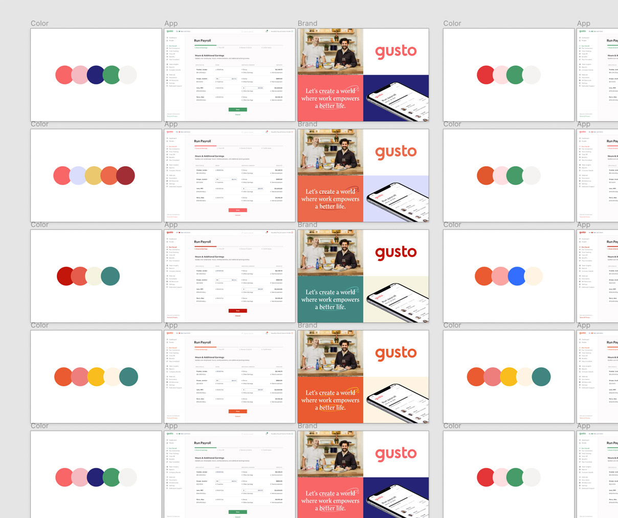
Exploring color palettes
Early logo mark explorations
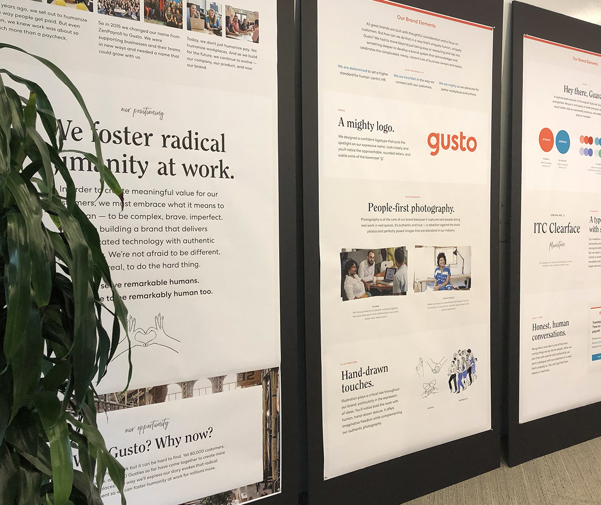
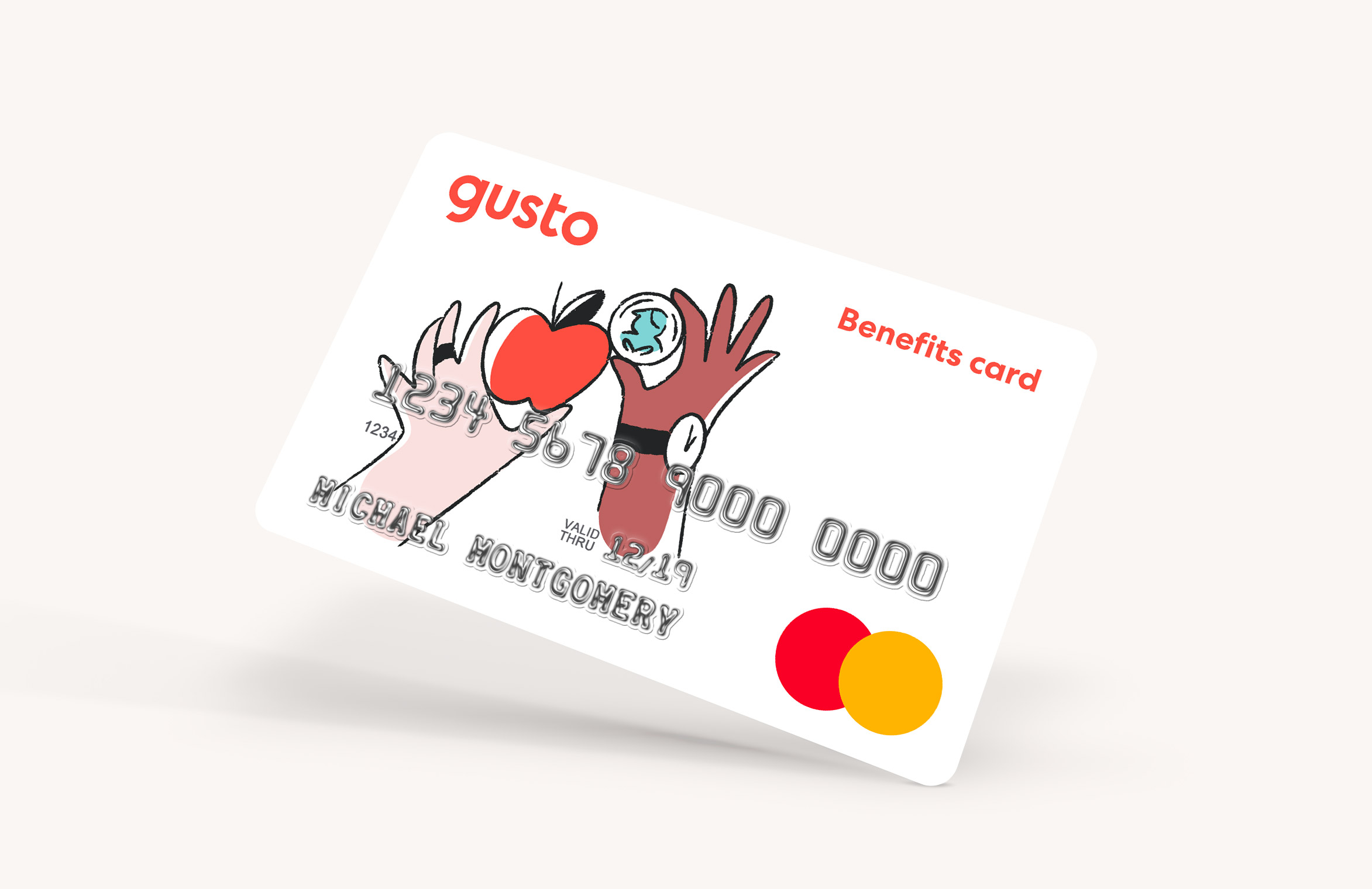
Brand guidelines
The visual directions I’d explored had a large impact on the final creative direction. Me and the rest of the brand team spent the next several months defining six key brand elements: logo, color, typography, art direction, illustration, voice and tone.
The result of those efforts was a comprehensive brand guideline created for designers and non-designers within Gusto. We provided assets and guidelines for how the brand should be used in different contexts.

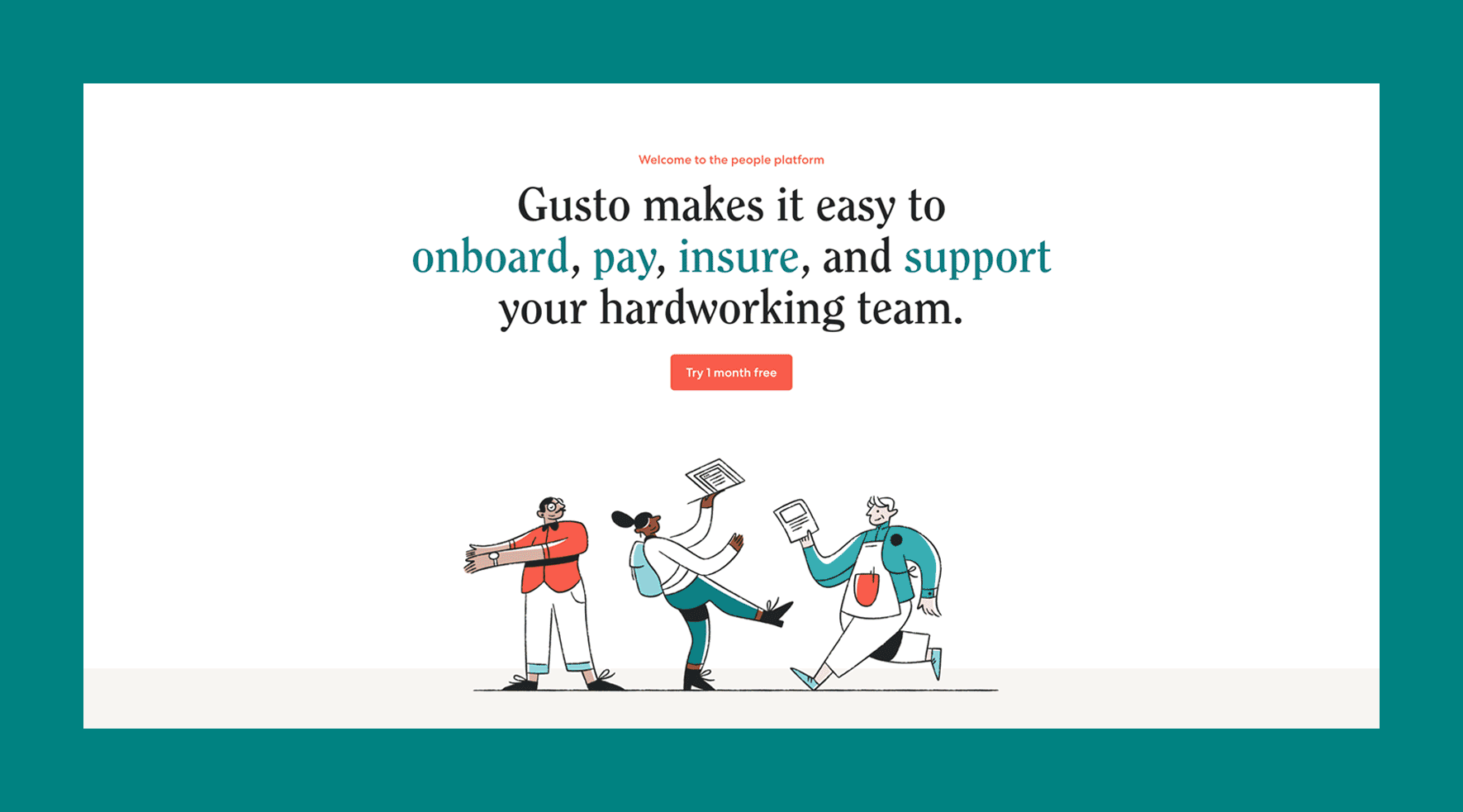
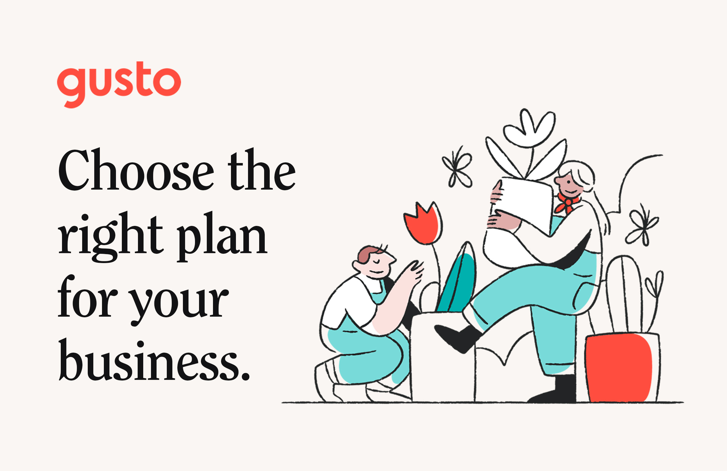
Seeing it all come together


Credits:
Micah Panama—Creative Direction
Ellen Ennes—Copywriting
Koto—Visual exploration and illustration
Jenna Carando—Logo and photography art direction
Micah Panama—Creative Direction
Ellen Ennes—Copywriting
Koto—Visual exploration and illustration
Jenna Carando—Logo and photography art direction